Summary
Sankey diagrams were first invented by Captain Matthew Sankey in 1898. Since then they have been adopted in a number of industries such as energy and manufacturing. In this post, we will take a look at how they can be used to represent the relationships within network data.
Understand relationships in network traffic data using Kentik’s Sankey diagram visualization
Seeing steam
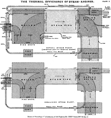
Sankey diagrams have been around for more than a century. The first one, drawn by Captain Matthew Sankey in 1898, was used to show the energy inputs, outputs and efficiency of a steam engine. In general, a Sankey diagram is a type of flow diagram where the width of the bands represent the proportional quantity of flow distributed over one or more dimensions. In the case of Captain Sankey’s original diagram, the “flow” is steam, and the dimensions are steam production and steam utilization. Sankey diagrams have since been adapted for many other uses to show flows of energy, materials, revenue, and more.
Visualizing network data
We often see network data presented in time-series visualizations — line graphs that indicate how traffic volume varied over time. Multi-line or stacked graphs can show how traffic is split over a single additional dimension. Time-series displays can’t easily show the traffic volume relationships among multiple dimensions, though, and this is where Sankey diagrams really shine as a way to visualize traffic flows in IP networks.
Showing how traffic volume is distributed over multiple dimensions makes it easy to spot significant relationships between different aspects of the traffic, for example, how traffic sources are related to traffic destinations. Kentik has made wide use of the Sankey visualization type in our Kentik network traffic analysis platform, starting first with our Peering Analytics feature, and then later as a general purpose visualization type in the Data Explorer.
The definitive guide to running a healthy, secure, high-performance network

To understand how Sankey diagrams work in Kentik, let’s look at a few examples. To start, we’ll look at a relatively simple example showing traffic measured in bits per second (bps), broken down by source IPs, destination IPs and services (protocol / port). To set that up, we’ll go to Data Explorer » Explorer View, click anywhere in the Group By Dimensions selector in the Query pane of the Sidebar, and choose the following dimensions:
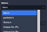
Then move down to the Metrics drop-down menu and select bits/s:
In the upper right hand corner (above the chart) we choose the visualization type:
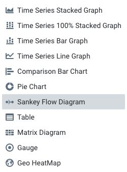
We will leave the rest of the panes with their default settings and click the blue Run Query button; Data Explorer returns a Sankey diagram that looks like this:
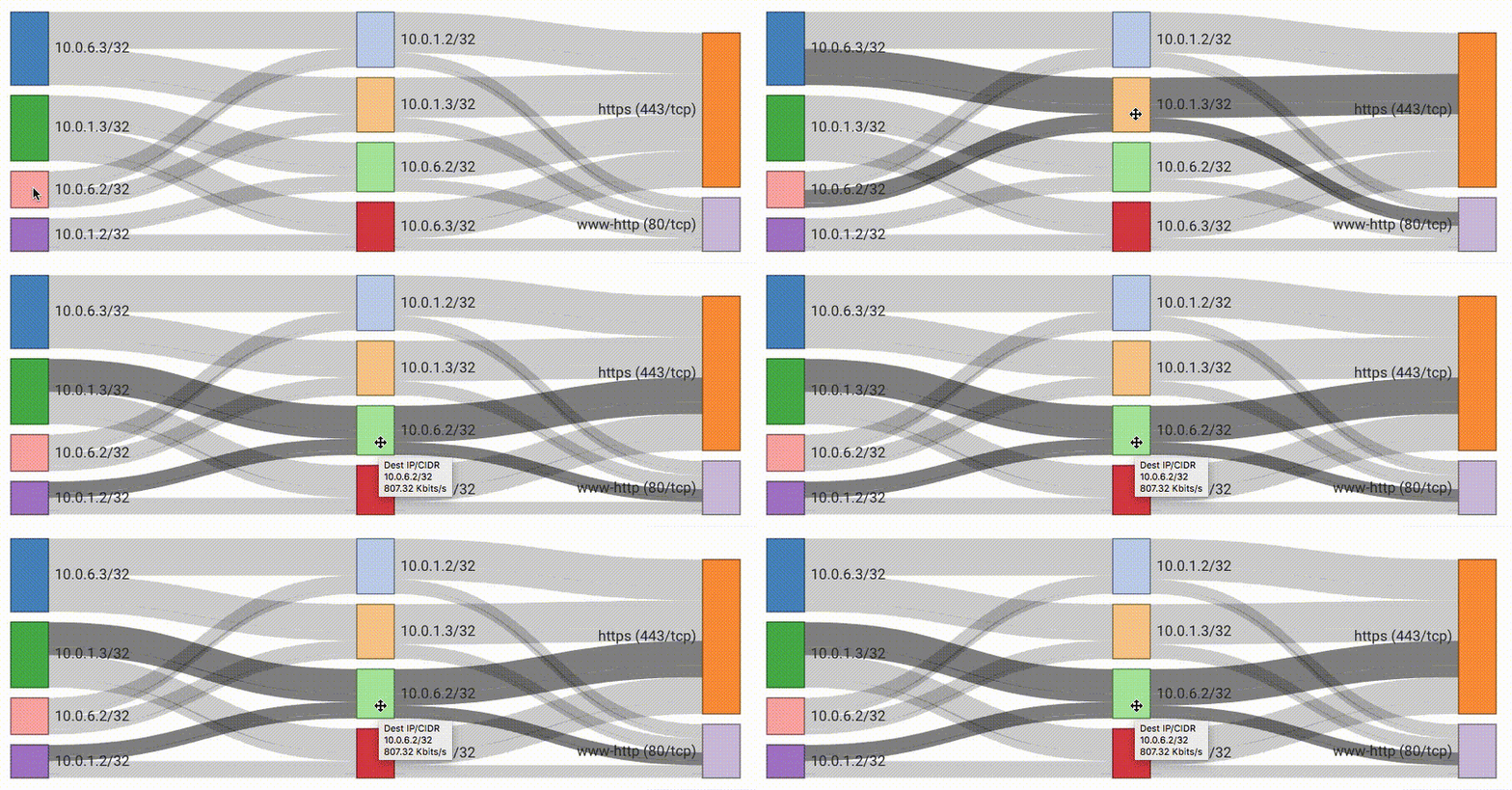
You’ll notice that the dimensions order (left to right) matches the order that was set in the Group-By Dimension selector — in this case, Source IP/CIDR, Destination IP/CIDR and Destination Protocol:IP Port. The connecting bands make it easy to see, for example, which destinations the source IP 10.0.6.3 was talking to, which services were in use for those connections, and the relative traffic volume represented by the width of the band. Visualizing network traffic this way makes it very easy to see top contributors for use cases like pinpointing root causes of congestion. Mousing over the different parts of the diagram highlights individual components, and reveals discreet traffic volumes in a tooltip.
Understanding cost per customer
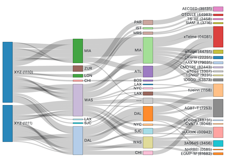
For companies that sell IP transit services, questions often come up about the load individual customers place on different parts of the network, especially in relation to revenue from each customer. Specifically, operators want to know where customers’ traffic enters the network, where it exits, which adjacent network(s) it exits to, and how far it is carried. For these providers, the answers lead directly to the cost per customer. A similar use case appears in enterprise networks, to understand how different departments, groups or services utilize the network.
To illustrate this, we will use the following Group-By Dimensions in the Kentik Data Explorer:
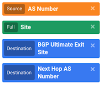
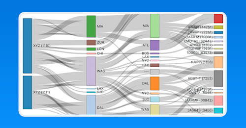
Once we run this query, we get a great visualization like the below, which makes it easy to see exactly where Customer XYZ’s traffic enters the network, where it exits, and which adjacent network it exits to.
Real-time situational awareness
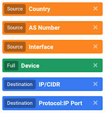
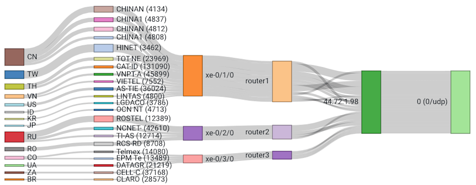
Another powerful use for Sankey diagrams is to visualize attack traffic entering a network, showing exactly where DDoS traffic is sourced from, how it entered the network, who’s targeted, and the type of traffic. As an example, let’s take a look at the following Group-By Dimensions:
Once we click the blue Run Query button, we get a chart like the one below. This kind of visualization provides instant situational awareness about how the attack is affecting the network and informs fast decision making about the appropriate response.
Troubleshooting data center congestion
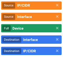
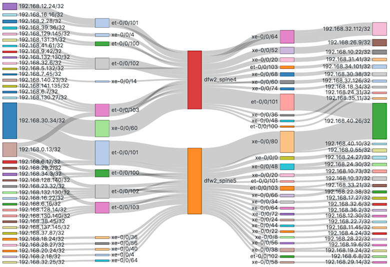
Many data center network teams need to look at east/west traffic across data center fabrics to see flows between services, servers, racks, or pods in addition to traffic across the external border out to the Internet. A Sankey diagram can provide instant visibility when troubleshooting data center congestion issues. To show an example of this, let’s use these Group-By Dimensions:
A query like this will result in a visualization that looks something like the image below. Congestion top contributors are easy to spot because they stand out as the biggest bars.
Workload network impact
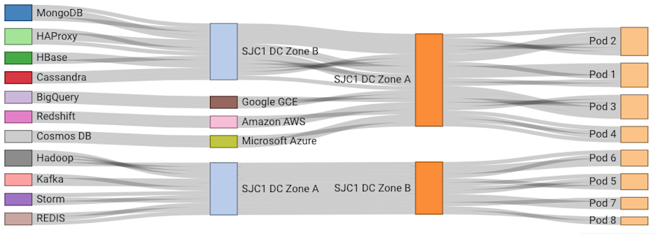
Data center operators also frequently want to understand which services are the top traffic producers and consumers. This is important for understanding how compute or storage workloads contribute to network load, and pinpointing root causes of data center congestion hotspots. In this example, we are using Kentik’s Custom Dimension feature which maps business specific data like service names onto network flow data. (Check out our Knowledge Base article for details on Custom Dimensions.) For this visualization, we’ll use the following Group-By Dimensions:
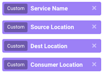
Once we have defined these Custom Dimensions and built our query as described in previous sections, we get a visualization that looks similar to this:
Geolocation relationships
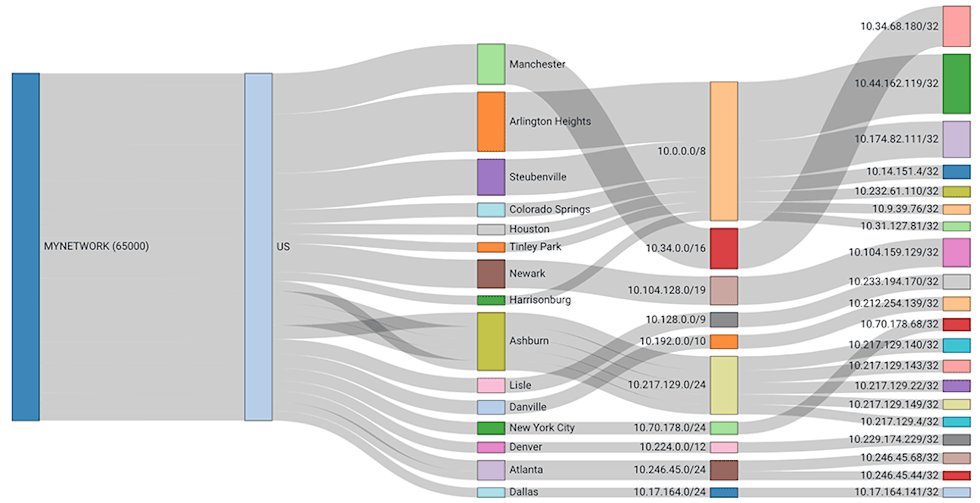
Understanding how traffic maps to geographic locations can be essential for network planning, user demographic analysis, and even product development and pricing. Kentik includes a built-in geolocation database, which automatically tags every flow with source and destination country, region, and city. By picking the Group-By Dimensions below (all Destination type) we can create a “traffic roadmap” for a specific remote ASN:
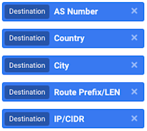
After running the query, the resulting visualization would look something like this:
Not already a Kentik customer? Start leveraging the powerful visualizations in Kentik today by requesting a demo or signing up for a free trial.


