Unleashing the Power of Kentik Data Explorer for Cloud Engineers

Summary
Kentik Data Explorer is a powerful tool designed for engineers managing complex environments. It provides comprehensive visibility across various cloud platforms by ingesting and enriching telemetry data from sources like AWS, Google Cloud, and Azure, and with the ability to explore data through granular filters and dimensions, engineers can quickly analyze cloud performance, detect security threats, and control costs in real-time exploration and historically.
Cloud infrastructure, whether a single cloud, hybrid, or multi-cloud environment, can be a complex beast to manage. For cloud engineers, visibility across distributed environments and the massive amounts of telemetry data they generate is not just a nice-to-have — it’s a need-to-have. Without a good way to explore, analyze, and act on the data, cloud performance issues can go unnoticed, security threats can slip through, and costs can skyrocket.
Kentik Data Explorer is a powerful tool for cloud engineers looking to make sense of the enormous volume and variety of telemetry data that flows through their infrastructure. Data Explorer is how engineers can explore the entire underlying database of telemetry in the system in real time and historically. That includes a diverse range of cloud and cloud-related data sources and relevant metadata such as application and security tags, geo-location, user/customer IDs, circuit IDs, DNS information, and more.
In effect, Data Explorer allows cloud engineers to slice and dice their data using Dimensions, the categorical filtering options that enable granular visibility into the entire database. This means that on one screen, you can parse data from multiple sources like your SD-WAN, AWS, and on-prem data center and track application activity across the entire thing.
In addition to Dimensions, Data Explorer also has a filtering wizard that allows you to get even more granular to chain filters to include or exclude whatever is essential to you in whatever time frame is relevant to you.
Ingesting and enriching diverse telemetry data
Kentik ingests a variety of important cloud telemetry such as AWS and Google VPC Flow logs, Azure NSG Flow logs, the various cloud firewall logs, cloud metrics, more specific types like Transit Gateway and VNET Flow logs, AKS, EKS, and GKE metrics, and so on.
However, it’s not just about collecting raw telemetry. Kentik enriches this data with multiple types of metadata that significantly enhance visibility by adding context.
In the screenshot below, you can see a simple example of the output of multi-cloud traffic.

This is a great start, but the likelihood is that you’ll want to go deeper because you’re looking into something very specific. To do that, we start to adjust our Dimensions and filters, including adding metadata.
Just a few examples of metadata include:
- Cloud provider tags
- Geo-IDs
- User and customer IDs
- DNS information
- Pod names and process IDs
- Security and application tags
- Custom metadata
That last bullet is pretty interesting. Kentik enables you to define your own metadata, allowing you to tag and categorize telemetry based on your specific requirements. This means you can make your queries more specific and contextually relevant.
So, with the added relevant metadata and all the other telemetry from on-prem resources, we get a more comprehensive view of cloud network traffic and inter-cloud communications.
Cloud optimization is crucial to delivering software with lean infrastructure operating margins and enhanced customer experiences.
Exploring data through dimensions
A Dimension is essentially any property of the data that you can use to organize, filter, and drill down into specific subsets of information. This makes Kentik Data Explorer such a versatile tool for cloud engineers.
Here are just a small few of the Dimensions Data Explorer has for cloud telemetry:
- Cloud provider (AWS, GCP, Azure)
- Regions (us-east-1, eu-west-1)
- VPC IDs
- Instance types (e.g., EC2, VM instances)
- Service tags (AWS Lambda, S3 buckets, GCP Cloud Functions)
- Applications and protocols (HTTP, HTTPS, DNS)
- Network interfaces (ENI, VNIC)
- Firewall Action
- AWS Transit Gateway
Look at the screenshot below, where you can choose Dimensions for AWS. Remember that this is just a portion of the AWS Dimensions and doesn’t even include the ones available for Google and Azure.

A cornerstone of network observability is being able to ask any question of your network. Using these Dimensions along with the other advanced filtering workflows in the system, cloud engineers can build granular queries and zero in on particular pieces of information, or in other words, ask any question about their cloud network.
For instance, an engineer could filter for all the traffic generated by EC2 instances in the US-West-2 region, narrow it down to a particular VPC, and then filter by application type (e.g., web traffic over HTTPS).
Granular filtering and workflow customization
I mentioned advanced filtering workflows, which is weird to say because the Dimensions menu is already pretty granular. What I mean by that is the ability in Data Explorer to create filtering workflows by layering multiple filters across different Dimensions, metrics, and timeframes. This way, you can extract precisely the dataset you need for your given scenario.
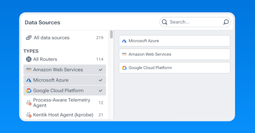
In the screenshot below, I selected AWS, Azure, and Google Cloud as my data sources, but this can also be any combination of data sources in the cloud and on-prem.

For example, take a cloud engineer troubleshooting a spike in traffic within a multi-cloud environment. They can build a filter workflow that:
- Filters by AWS, Azure, and GCP simultaneously
- Drills down into specific regions where the traffic spike occurred
- Focuses on a particular type of resource (e.g., compute instances or containerized applications)
- Filters traffic generated by a particular application, such as a customer-facing web service
- Zooms into traffic flows from specific geographic locations
Then, once these filters are applied, you can adjust timeframes, call out specific metrics (e.g., throughput, latency, packet loss), include or exclude particular elements, and choose from a variety of visualizations (heatmaps, time series charts, Sankey, bar graphs) to make the data easier to digest.
Take a look at the following screenshot. You can see an example of the layering of additional filters on top of our Dimensions. I have a couple of exclusions at the top, including a specific IP, a specific project ID, and an application. This relatively simple filter allows you to see some of the options, but in a large production environment, they can be much more complex.

Real-time exploration and historical comparison
An essential feature of Data Explorer is the ability to compare datasets across timeframes. Cloud engineers often must determine whether an anomaly or spike is part of a recurring issue or something new. Data Explorer allows engineers to filter a dataset in real time and instantly compare it to the same dataset from a previous timeframe.
For example, suppose an engineer notices unusually high latency in a specific VPC. In that case, they can filter the data to examine only traffic in that VPC, identify the impacted services, and then compare the latency metrics from the past hour against a similar timeframe the previous day, week, or month. This temporal comparison helps cloud engineers diagnose whether the issue is transient, cyclical, or persistent.
You can make this comparison across all Dimensions, so you can filter by geo-location, cloud provider, and instance type, and still compare performance metrics from different timeframes. The ability to do this in real time is vital for cloud operations where rapid decision-making can prevent potential outages or performance degradation.
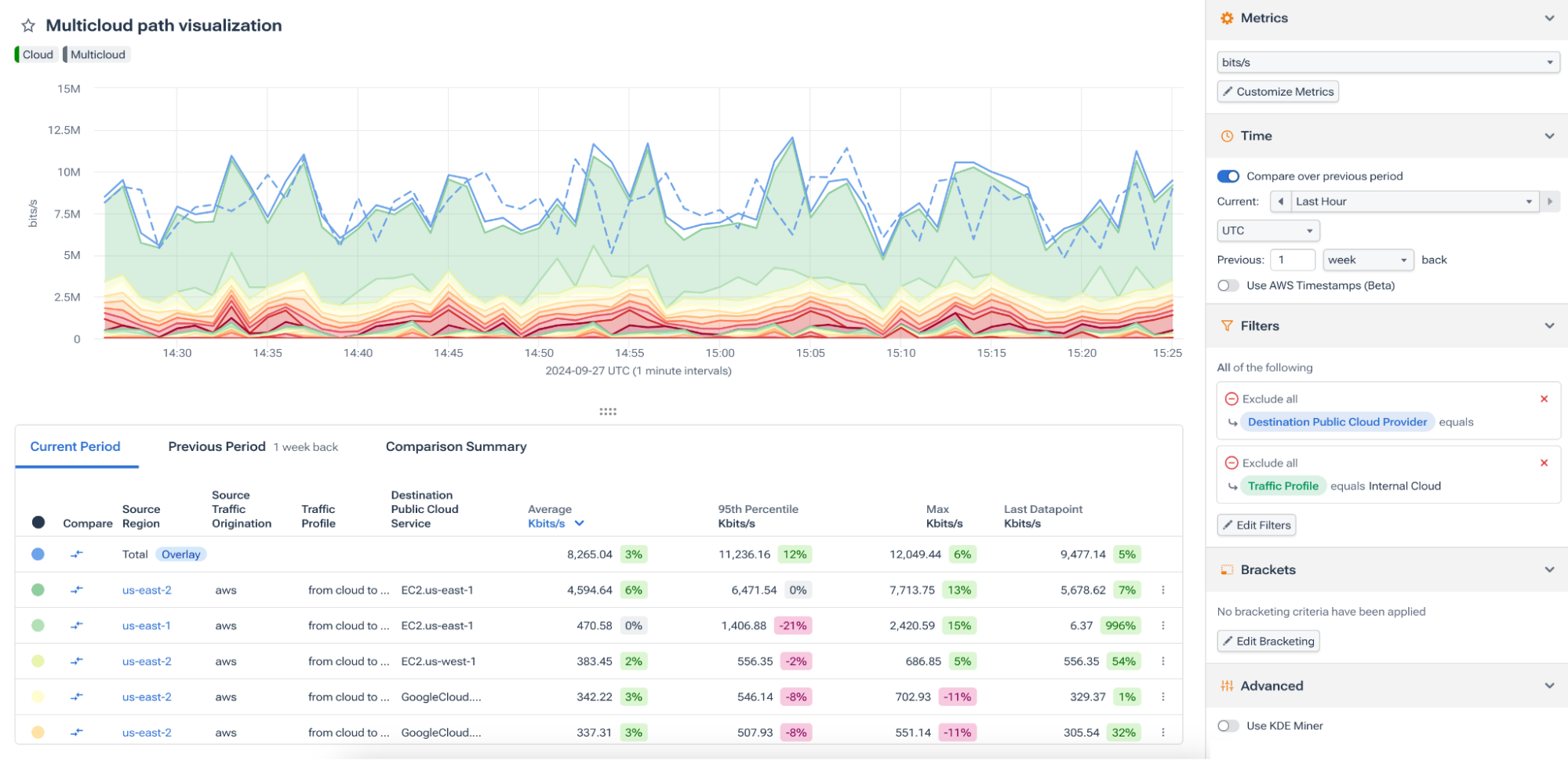
In the last screenshot below, you can see our multi-cloud traffic along with the query settings on the right. I have the toggle enabled for “Compare Over Previous Period” and the timeframe set for comparing the last hour to the previous week. In the actual graph, the dotted line (which you can click on in the platform) represents the historical data we’re comparing the last hour to.
Cloud engineers need a tool that gives them complete visibility into their infrastructure. Kentik Data Explorer provides this visibility by ingesting various telemetry data, enriching it with relevant metadata, and enabling engineers to explore it through Dimensions and granular filters.
By supporting real-time exploration and comparison across timeframes, Kentik Data Explorer is more than just a monitoring tool—it’s a comprehensive platform for data-driven cloud management. Whether managing a single cloud, hybrid, or multi-cloud environment, cloud engineers can leverage Kentik Data Explorer to gain deeper insights, troubleshoot issues faster, and ultimately deliver better cloud performance.
