How to Build Effective Dashboards: Key Principles and 5 Examples for Cloud Monitoring
Summary
If you work in this industry, chances are you use dashboards. But how do you build an effective dashboard that goes beyond pretty graphs and actually provides insight? In this post, we offer key principles for dashboard creation and share how we build them at Kentik, with examples of our dashboards for cloud monitoring.
If you work in this industry, chances are you use a dashboard of some sort. Dashboards are, after all, intended to “provide at-a-glance views of KPIs (key performance indicators) relevant to a particular objective or business process,” according to Wikipedia. In other words, dashboards help teams focus on what matters.
Building a dashboard is not hard, especially when you have lots of data available and many choices on how to visualize it. However, to build a dashboard that provides true insight is NOT easy, especially with large datasets and many visualization choices. Common questions that are difficult to answer include:
- What are the most important views?
- Which diagrams should I include to answer the question(s) at hand?
- Which type of chart provides the best understanding? (Line? Bar? Pie? Stacked? Sunburst?)
- Which filters will properly scope the view?
- Should I embed relevant alerts into my dashboard?
At Kentik, we focus on analytics and visibility across all networks, and our platform provides powerful dashboarding and customization capabilities. That’s why we wanted to share our philosophy on effective dashboards and some best practices we’ve learned from working with many customers.
General Principles for Effective Dashboards
No matter what kind of dashboard you are building, there are a few universal principles for creating effective dashboards.
Know your audience
Just like when you’re preparing for a speech or presentation, one of the first questions should be “Who is the audience?” The same logic applies here. Some example audiences we often see are:
- Management and executives usually want an overview rather than thousands of drill-down details. They typically care more about business impact than in-depth technical analysis and metrics.
- NetOps and NetEng teams now face enormous infrastructure complexity. With projects that are often deployed across physical data centers and multiple cloud regions and zones, they often want to see comprehensive operational pictures to help visualize capacity, performance, throughput, and other metrics.
- SecOps teams in their day-to-day jobs are all about control, policy, hardening, and hunting. A dashboard that contains detailed security analytics and forensics is essential for investigating potential and historical threat activity.
Interviews and communication with stakeholders will help you nail down the audience if you are tasked with building dashboards for others.
What’s the purpose?
Think about the objective and outcomes of the proposed dashboard(s). Are they strategic? Operational? Analytical? Or maybe a multi-purpose dashboard that serves multiple stakeholders. Even within a single audience, dashboards that are used daily may have different purposes from dashboards used for monthly or quarterly review.
Tell the story
Making sense of data requires more than just grouping data logically. Real insight comes from telling the true story CLEARLY. Ideally, your dashboard should guide viewers the key points in the storyline. You may want to spend some time thinking about how to structure, organize and tell a story about the data that maximizes the impact.
Every story has a conclusion, and your dashboard should too. If they’re not providing actionable insights, dashboards devolve into a set of pretty graphs without meaning. To tell a story with an effective conclusion, think about the next actions users will take after viewing the dashboard.
Keep it succinct
Less is more — no one likes busy dashboards that are overloaded with data. Knowing exactly what you need in your dashboard is most important. A great-looking dashboard means nothing without the right information (or with too much). Choose only the most important components.
5 Dashboards for AWS and GCP Cloud Visibility
To highlight some of the considerations above, let’s review some dashboards that Kentik has recently added to support the launch of our cloud visibility solution:
1. “GCP Traffic Trends and Overview”
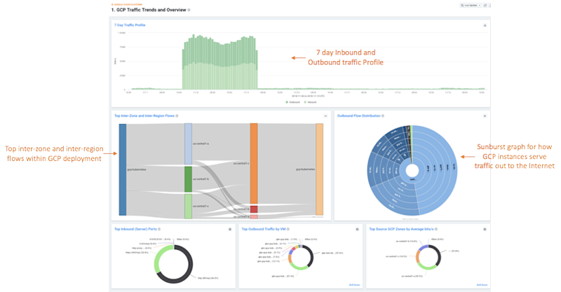
This dashboard was built with both executive and technical consumers in mind. By surfacing interesting traffic patterns and trends, this dashboard answers the question: “What’s happening on my network today?” The panels on this dashboard give the user a quick comparison of ingress vs. egress traffic in both a time-series and total-comparison format, which are useful starting places for network investigations or at-a-glance anomaly detection.
The dashboard also addresses two key questions that are critical to understanding cloud network activity, presented in visually interesting ways. The Sankey diagram shows the top inter-zone and inter-region flows found within your GCP deployment, which can drive significant data transfer costs if not monitored carefully. The Sunburst diagram on the right shows how top GCP instances are serving traffic out to the Internet with an interactive breakdown showing source ports that you’re delivering services from, the machine or machines hosting that service, followed by the zone, subnet, destination ASNs, and even top destination IPs that are consuming those services. If you’ve not checked out Sunburst visualizations yet, they’re a great way to visualize multi-dimensional traffic data!
2. “AWS Traffic - 30 Day Overview”
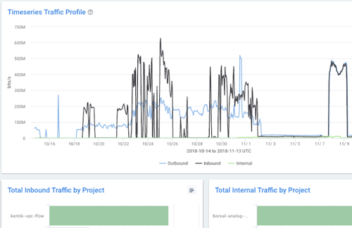
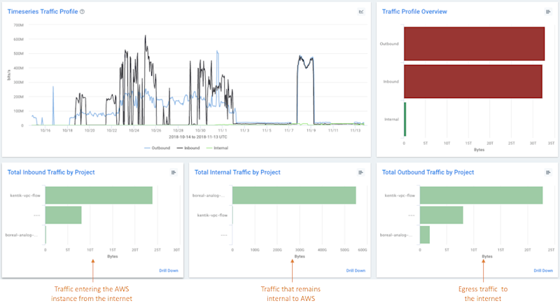
The panels on this dashboard are geared toward financially-minded stakeholders within an organization, but they have cross-department utility as well. The main goal is to understand which elements of AWS network activity are driving the greatest transport costs. In case you’ve not already heard, per-GB network costs in the cloud can be up to 10x what you’re used to paying for typical Internet access from network carriers. So tracking and fully understanding what’s behind these charges are critical for achieving your cloud-spending targets.
Following some of the design principles discussed earlier in this article, we configured this dashboard (and all of the dashboards you’ll see highlighted here) to tell a story with a coherent and organized structure. The dashboard is divided into three columns “below the fold.” The left column shows traffic entering your AWS infrastructure from the Internet. The middle column shows traffic that remains internal to AWS, and the right column shows egress traffic.
We chose to display 30 days worth of data, aggregated by the total amount of data transferred over the last 30 days, rather than a data rate, such as bits-per-second. We believe this is the best way to accurately compare your cloud bills with Kentik data and determine exactly which team or project is responsible for the traffic that’s racking up huge charges on your end-of-month invoices.
3. “GCP Activity and Performance Overview”
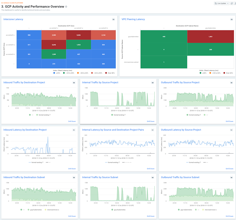
This dashboard was truly designed for the techie at heart. It follows the same design pattern mentioned above, but takes it a step further by showing the ingress, internal, and egress traffic perspectives grouped by multiple dimensions and metrics, including project, subnet, zone, and VM. You’ll also notice that every other row alternates to show these critical boundary points by both bits-per-second and also the ever-useful GCP latency metric, which combines application and network latency for every TCP flow.
In order to provide a familiar look and feel, we chose to render this data using stacked line charts, which might remind you of tools used in the past, like Cacti and MRTG. Of course, you can dive much deeper into these graphs than you can with the typical MRTG chart. Any of them can be used as great starting places for network spelunking. Just find a graph that shows the anomaly you’re interested in, or one that features the subnet, VM, or project you’re trying to analyze. Then you can click into each graph and drill down with the Kentik Data Explorer.
4. “GCP Customer Analytics”
Who are your customers? What is the quality of their experience with your service or application? Are they being served by the best GCP infrastructure? These are the questions we help answer with our GCP Customer Analytics dashboard. This report was constructed with an eye toward organizations that are serving traffic to their customers directly from Google. It provides a super useful visualization that depicts counts of unique destination IP addresses on top of a Geo-heatmap. This gives the user quick insight into which parts of the world are being served by their GCP infrastructure.
The dashboard goes further by showing you these destination geolocations matrixed with source zones, and color-coded by highest activity in order to help you understand if you’re serving traffic out of the appropriate zones and, by extension, if you might want to consider expanding your GCP footprint. By using the round trip + application latency metric, you can use this dashboard to infer the experience your customers are having and establish alert policies that notify you of potential scaling or performance issues that should be addressed.
One other great thing about all of these preset dashboards is that they can all be used to drill down even further into your data. For example, pick almost any panel on any dashboard and select an element on the graph. In this case, we’ve selected the panel titled “Inbound Latency by Destination Project” and clicked on the ‘boreal-analog-7’ item.
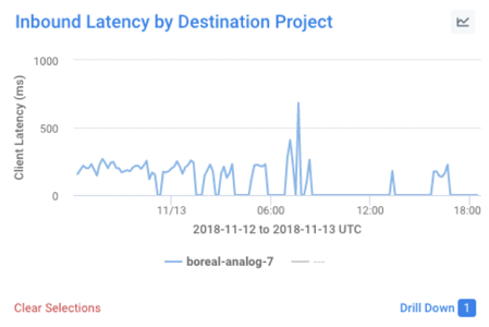
When we click on the “Drill Down” link, we can then use the “GCP Project Explorer” dashboard to isolate the traffic that was most likely the cause of the latency spike in the graph shown above:

5. “AWS Security Analysis”
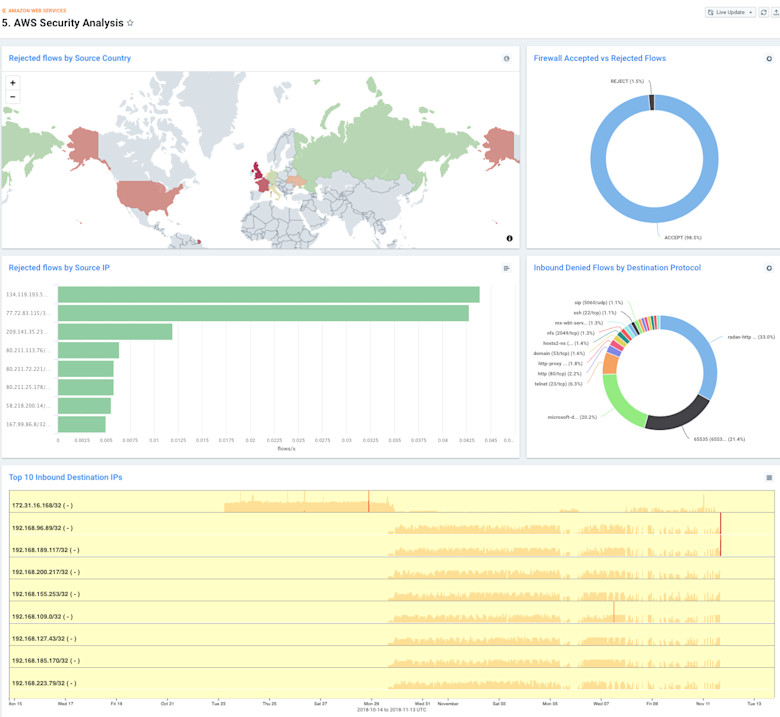
AWS VPC Flow Logs include a unique feature that we absolutely love: a field that indicates the firewall action for each flow. For background, AWS allows users to define network ACLs and firewall rules as part of their VPC architectures. This allows you to specify precisely which traffic is allowed into your environment and thus, count when traffic does or does not match your allowed ruleset. This is, of course, extremely helpful in identifying targeted attacks against your AWS infrastructure.
We chose to break this analysis out into a few helpful visualizations. First, we show the top geolocations that are originating denied. Then, we break out those denied flows by destination port on your GCP network. And finally, we show you which IPs were the source of the most denied flows.
Summary
Much has been said about the power of large datasets, but the fact is, without proper organization and a proper storyline, it remains “just data.” Effective dashboards go a long way toward making network analytics data useful and actionable for stakeholders across any organization.
To learn more about Kentik’s dashboards for cloud visibility, please see the Kentik for Google Cloud VPC Flow Logs blog post and KB article, as well as the How Kentik Helps Assess AWS Visibility blog post and KB article. Or, if you’d like to explore these dashboards directly, you can sign up for a free trial.
Contributors: Dan Rohan, Product Manager & Crystal Li, Senior Product Marketing Manager
